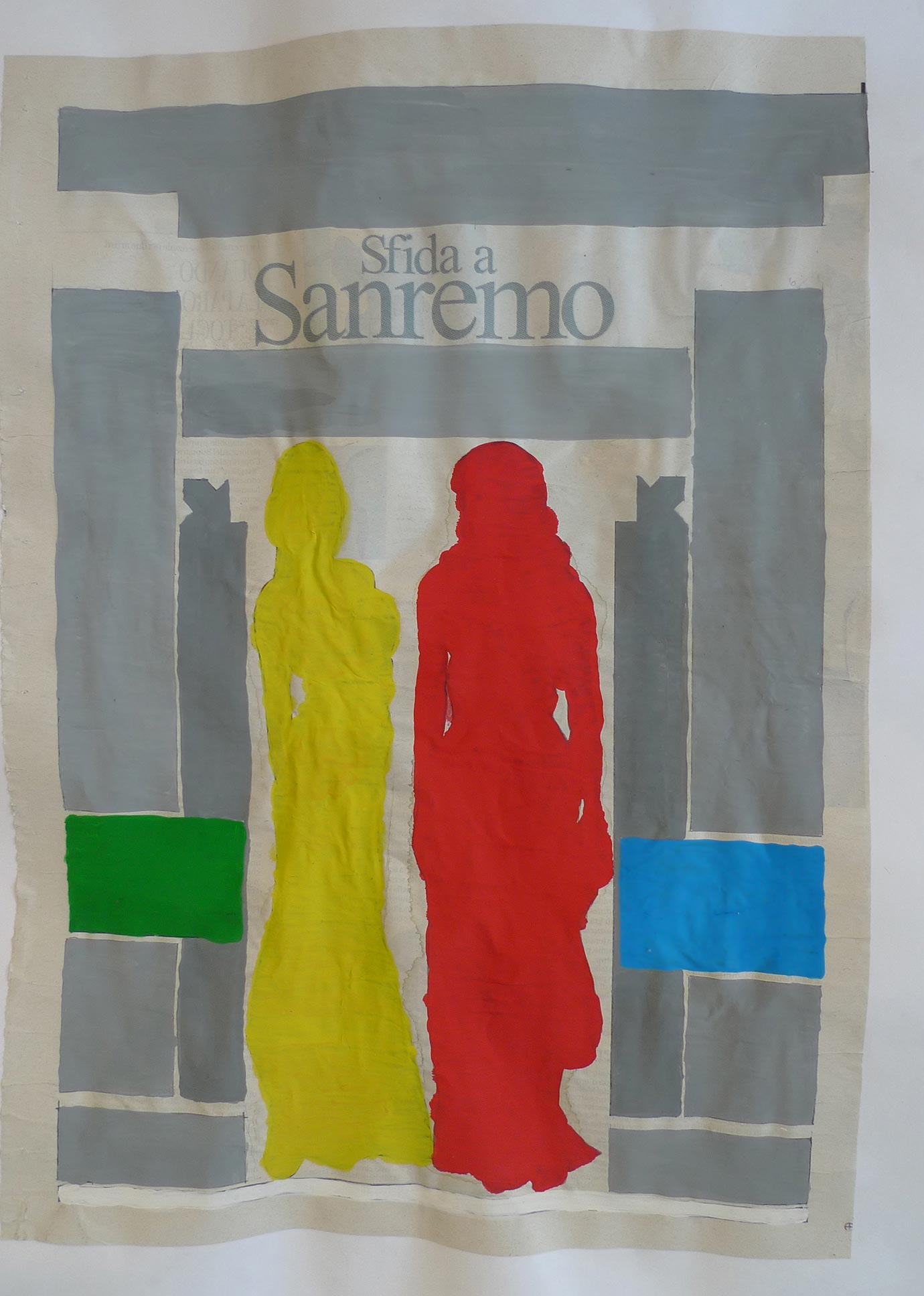
Typo Painting
In order to become aware of the structure of the layout in a newspaper, which very often escapes our attention, the students are invited to paint all the columns in gray, the pictures in a color they choose and the advertisements in white. Depicted with those monocrome colors and annihilating any content or text, the rectangular forms acquire a very strong visibility and the ground structure, thought out and projected by a graphic designer, catch our eye and gain the first level of vision. The exercise is thought to be the construction process the other way round: canceling the content; what remains is the scaffolding.


